Simple Vs. Complex: What Design Is Best For Storefront Signs In Michigan?

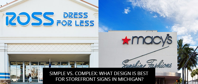
When it comes to storefront sign design, is it true that less is more, or is it a bore? To help you create effective storefront signs, today’s post reviews research comparing the marketing impacts of simple and complex designs.
Read on to learn more, or email support@d9nsigns.com to start conversing directly about your storefront signage needs.
Simple Vs. Complex: Which Is Best For Storefront Sign Designs?
In a 2020 study evaluating consumer responses to storefront signs, researchers at the Interdisciplinary Journal of Signage and Wayfinding found that “feature complexity had mixed results on favorable evaluations,” which changed dramatically depending on the viewing context (Knuth et al., 2020, p. 7).
When complex designs were used for storefront signs intended to be read by passing drivers, they performed poorly, even in areas with low speed limits. Drivers simply did not have time to study complex signs containing long messages and multiple design features, and rather than risking long gazes, they tended to ignore complex signs altogether. The same effect was noted with pedestrians viewing complex storefront signs, though to a lesser degree, since they travel at slower speeds and can afford to take their eyes off the sidewalk for longer.
So, if you want to optimize your storefront sign design, it’s best to keep it simple, limiting yourself to one or two graphic elements and a few punchy words of text. To increase conspicuity and legibility without complicating your design, you may want to consider using:
- More contrast between the font and substrate
- External or internal illumination
- High-resolution graphics that grab the eye and evoke a sense of movement
- Sans serif fonts in place of serif fonts
- Mixed case lettering instead of all uppercase


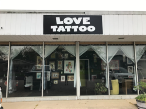
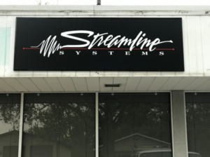
Enhance your storefront sign visibility with bold, sans-serif fonts, evocative graphics, and high-contrast coloring.
For more simple storefront sign tweaks, get in touch with our team.
Of course, that doesn’t mean you should always use simple designs—complex, feature and information-rich designs have their place in any sign system. In fact, when complex designs were used in-store, to provide additional product information, these designs dramatically outperformed simpler counterparts, producing longer total fixation duration and higher fixation in experiments at 105 garden centers, and receiving higher ratings for attractiveness and utility overall.
Put Design Theory To Practice: Order Storefront Signs At Signs By D9N Designs Today!
At Signs by D9N Design, we can design, fabricate, and install a variety of high-quality, custom-made signs for clients in Allendale, Grand Rapids, and anywhere else in West Michigan. To begin your free storefront sign design consultation, or learn more about any of our other services and products, you can:
- Call 1-888-992-1688
- Email support@d9nsigns.com
- Request a consultation via our website
References
Johnston, M. P., & Mandel, L. H. (2014). Are we leaving them lost in the woods with no breadcrumbs to follow? Assessing signage systems in school libraries. School Libraries Worldwide, 38-53.
Knuth, M., Behe, B. K., & Huddleston, P. T. (2020). Simple or complex? Consumer response to display signs. Interdisciplinary Journal of Signage and Wayfinding, 4(2), 7-22.
Rexhausen, J., Hildebrandt, G., & Auffrey, C. (2012). The Economic Value of On-premise Signage. Signage Foundation.
Back
